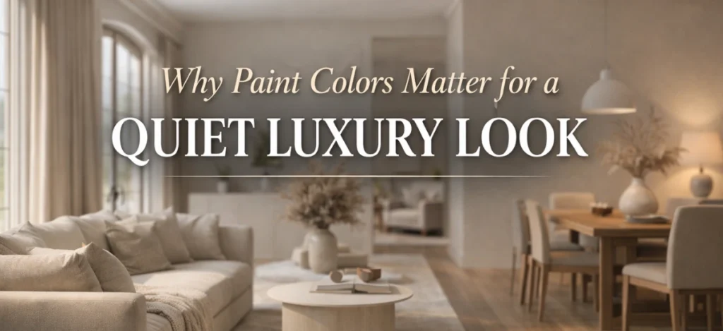
Luxury does not always mean bright colors, heavy designs, or expensive decoration. In recent years, a new interior design trend has become very popular, called quiet luxury. This style is all about calmness, simplicity, and timeless beauty. It focuses on soft colors, clean finishes, and a peaceful atmosphere instead of loud or flashy looks.
One of the most important elements of quiet luxury interiors is paint color. The right wall color can completely change how a space feels. Soft, muted, and elegant shades can make a home look expensive, well-designed, and comfortable at the same time.
In this blog, we will explore the best paint colors for a quiet luxury look, why they work so well, and how you can use them in different rooms of your home. This guide is written in simple English so anyone can understand and apply these ideas easily.
What Is Quiet Luxury in Interior Design?
Quiet luxury is a design style that focuses on understated elegance. It is not about showing wealth. Instead, it is about creating a refined, peaceful space with high-quality choices and thoughtful details.
Key features of quiet luxury include:
- Soft and neutral color palettes
- Minimal patterns and clean lines
- Natural materials like wood, stone, and linen
- Timeless design instead of trends that fade quickly
- Calm and balanced interiors
Paint colors play a huge role in this style because walls are the largest visual element in any room. When the color is right, the entire space feels more polished and expensive without trying too hard.
Why Paint Colors Matter for a Quiet Luxury Look
Paint color is often the first thing people notice when they enter a room. It sets the mood, reflects light, and affects how furniture and décor appear.
Here is why paint colors are so important for quiet luxury:
- They create calmness
Soft shades make a room feel relaxing and welcoming. - They make spaces look bigger and brighter
Light neutral colors reflect natural light beautifully. - They highlight quality over quantity
Simple wall colors allow furniture and materials to shine. - They never go out of style
Neutral and muted shades stay elegant for years.
Choosing the right paint color is one of the easiest and most cost-effective ways to achieve a quiet luxury look.
Characteristics of Quiet Luxury Paint Colors
Before choosing specific shades, it is important to understand what makes a paint color suitable for quiet luxury interiors.
Quiet luxury paint colors are usually:
- Soft and muted (not bright or bold)
- Neutral or earthy in tone
- Warm or balanced, not harsh
- Easy on the eyes
- Timeless and elegant
Avoid very strong colors like neon shades, bright reds, or loud yellows. These can overpower the space and break the calm feeling that quiet luxury aims to create.
Best Paint Colors for a Quiet Luxury Look
Choosing the proper paint colors is the most important step in creating a quiet, luxurious interior. These colors are not loud or in search of. Instead, they sense gentle, balanced, and naturally elegant. Quiet luxury paint shades help create a peaceful surroundings, even as making the space look subtle and upscale. The awareness is on undying colours that work properly with natural light, top-rate materials, and minimal décor.
Now allow’s explore the most popular and effective paint colors that assist create a quiet luxury indoors.
1. Soft Off-White and Cream Shades
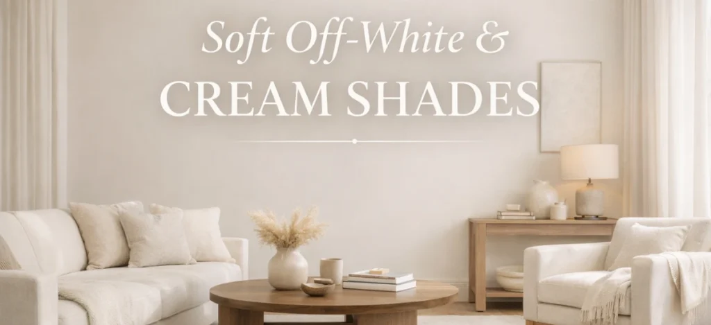
Soft off-white and cream shades create a peaceful and balanced base for quiet, luxurious interiors. These colorations bring brightness right into a space whilst keeping the overall look heat and welcoming. Unlike natural white, off-white has mild undertones that make rooms feel more snug and refined. It allows herbal textures, furniture, and lights to stand out, making the complete space feel elegant and thoughtfully designed.
Why Off-White Works
- It reflects light and brightens the room
- It creates a peaceful background
- It pairs well with almost every material and color
- It never feels outdated
Unlike pure white, off-white has warm undertones that make a space feel cozy and inviting.
Best Places to Use Off-White
- Living rooms
- Hallways
- Bedrooms
- Open-plan spaces
Styling Tips
- Pair off-white walls with wooden furniture
- Use textured fabrics like linen or cotton
- Add warm lighting for a soft glow
Off-white walls instantly make a home look clean, elegant, and expensive.
2. Warm Beige and Soft Taupe
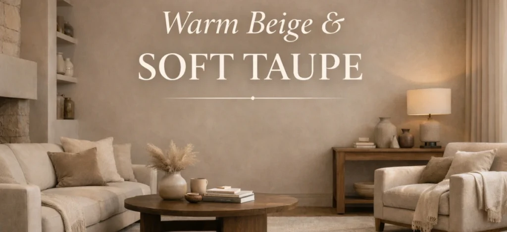
Warm beige and soft taupe shades add a feel of consolation and quiet sophistication to any indoor space. These colors feel wealthy without being heavy and assist create a soft, welcoming environment. Beige brings herbal warmth, while taupe adds subtle depth, making areas look extra polished and balanced. They paintings particularly well in living rooms and bedrooms, in which a relaxed but high-priced feeling is essential.
Why Beige and Taupe Are Perfect for Quiet Luxury
- They feel natural and calming
- They add depth without being loud
- They work beautifully with neutral décor
- They suit both modern and classic interiors
Taupe is especially popular because it sits between gray and brown, making it very balanced.
Best Places to Use Beige and Taupe
- Living rooms
- Dining areas
- Bedrooms
- Home offices
Styling Tips
- Combine with cream or off-white trims
- Use natural textures like stone or wool
- Keep décor minimal to maintain elegance
These colors are ideal if you want warmth without losing the refined luxury feel.
3. Soft Gray with Warm Undertones
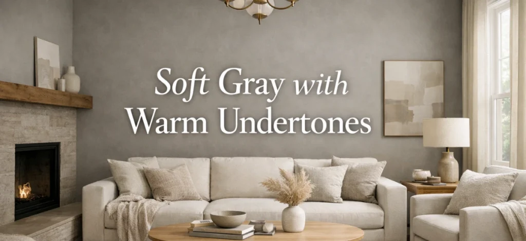
Soft grey sun shades with warm undertones are ideal for growing a quiet luxury look without making the distance senseless. Unlike cool or bluish grays, warm grey adds softness and balance to the room. It creates an easy and contemporary look while nonetheless feeling cushty and welcoming. This sort of gray works superbly with heat lighting, wooden textures, and neutral décor factors.
Choosing the Right Gray
Avoid cool or blue-toned grays. Instead, go for:
- Warm gray
- Greige (gray + beige)
- Soft, light gray shades
These shades feel cozy and elegant instead of cold.
Why Warm Gray Works
- It looks modern and timeless
- It creates a balanced and clean look
- It pairs well with metal, wood, and fabric
Best Places to Use Soft Gray
- Living rooms
- Bedrooms
- Bathrooms
- Modern apartments
Styling Tips
- Pair with white or beige accents
- Use warm lighting
- Add soft fabrics to avoid a flat look
Warm gray is perfect for people who want a modern luxury look without harsh contrast.
4. Muted Earthy Browns
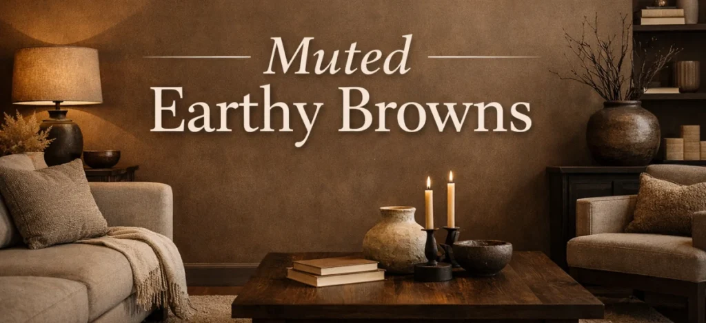
Muted earthy brown sun shades add intensity and heat to quiet luxurious interiors without feeling heavy. These colorings are stimulated by means of nature, which makes the distance sense grounded and calming. Soft brown tones create a sense of stability and luxury while nevertheless being subtle and fashionable. When used thoughtfully, in particular on feature partitions or relaxed rooms, they create richness and an undying luxurious experience to the interior.
Why Earthy Browns Feel Luxurious
- They connect interiors to nature
- They add depth and richness
- They feel warm and sophisticated
Muted browns are different from dark chocolate shades. They are softer and more subtle.
Best Places to Use Earthy Browns
- Feature walls
- Dining rooms
- Study rooms
- Cozy corners
Styling Tips
- Pair with beige or cream walls
- Use wooden furniture
- Add indoor plants
Earthy brown shades make a space feel elegant, calm, and deeply comfortable.
5. Sage Green and Muted Greens
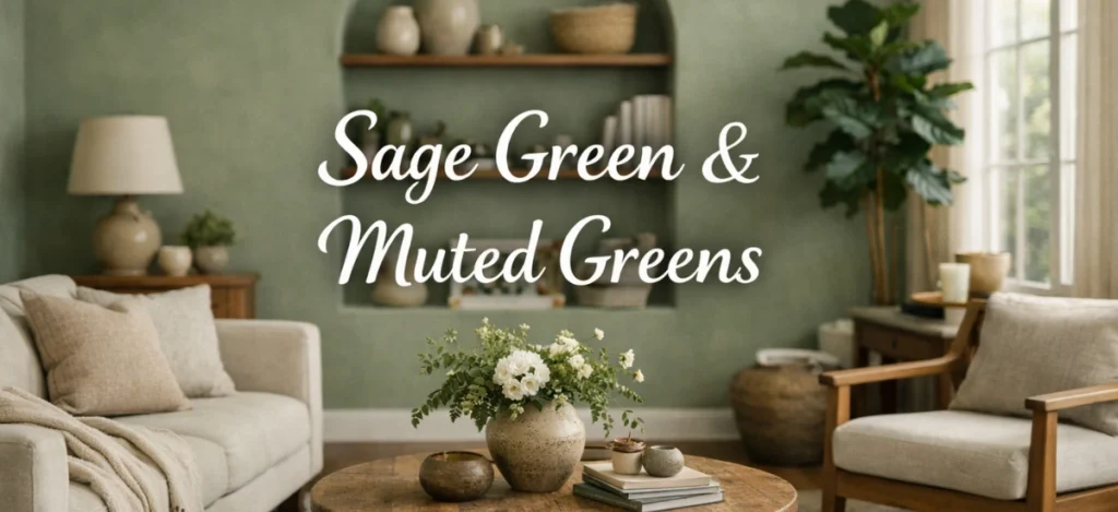
Sage green and other muted green sunglasses bring a sense of calm and balance into quiet luxury interiors. These colours experience sparkling yet subtle, making them clean at the eyes and snug to live with. Inspired by nature, muted greens create a non-violent environment whilst nevertheless looking elegant and delicate. They work specifically properly in bedrooms and living areas where rest and softness are critical.
Why Muted Green Works
- It feels relaxing and fresh
- It brings a natural element indoors
- It works well with neutral palettes
Sage green, olive green, and soft moss tones are perfect choices.
Best Places to Use Green Shades
- Bedrooms
- Living rooms
- Kitchens
- Reading areas
Styling Tips
- Pair with white or beige walls
- Use wooden and brass accents
- Keep décor simple
Muted greens create a peaceful and refined environment without being overwhelming.
6. Soft Blue and Dusty Blue Shades
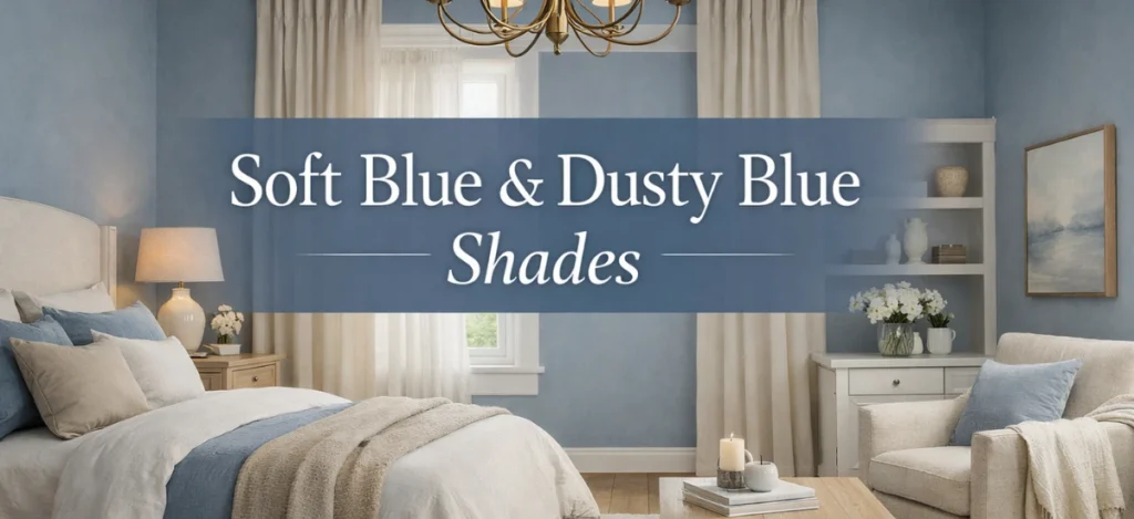
Soft blue and dusty blue sunglasses can create a relaxed and stylish ecosystem when used in quiet, luxurious interiors. These muted tones sense of soothing in place of bloodless and help bring a feel of depth to the gap. Unlike vibrant blues, dusty blue looks refined and undying. It works beautifully in bedrooms and toilets, especially while paired with mild neutrals and heat lights.
Best Blue Shades for Quiet Luxury
- Dusty blue
- Gray-blue
- Soft navy (for accent walls only)
Avoid bright sky blue or electric blue shades.
Why Muted Blue Works
- It feels calm and soothing
- It adds subtle depth
- It looks elegant in both modern and classic homes
Best Places to Use Muted Blue
- Bedrooms
- Accent walls
- Bathrooms
Styling Tips
- Pair with white and beige
- Use soft fabrics
- Keep accessories minimal
Blue tones are ideal if you want a peaceful and relaxing space.
7. Greige: The Perfect Luxury Neutral
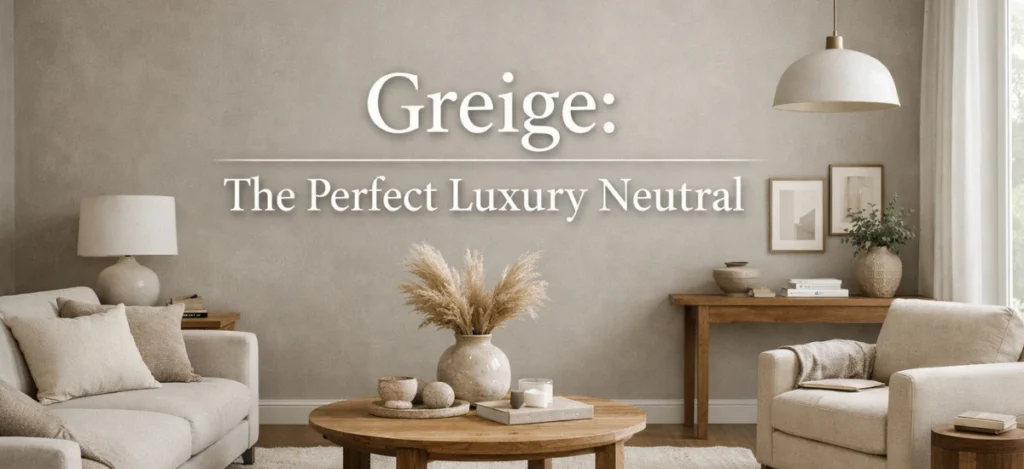
Greige, an excellent combination of grey and beige, offers the right balance for quiet luxury interiors. It combines the warmth of beige with the sophistication of grey, making it versatile and timeless. Greige partitions create a gentle, elegant backdrop that works well with both present-day and traditional furniture. This impartial coloration enhances herbal light, adds depth, and continues a calm, expensive ecosystem for the duration of any space.
Why Greige Is So Popular
- It balances warm and cool tones
- It works in all lighting conditions
- It suits almost every room
Greige looks elegant without trying too hard.
Best Places to Use Greige
- Living rooms
- Bedrooms
- Hallways
- Open spaces
Styling Tips
- Use white trims
- Add warm lighting
- Choose soft textures
If you are unsure which color to choose, greige is a safe and stylish option.
How to Choose the Right Paint Finish
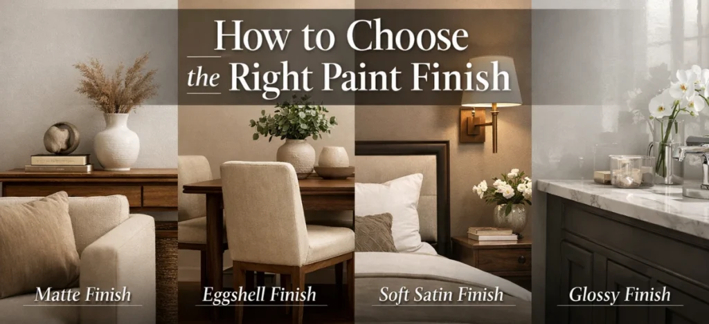
While selecting the proper paint coloration is crucial, selecting the right end is equally vital for attaining a quiet luxury interior. The end influences how mild interacts with your partitions, how smooth the coloration appears, and the way fashionable the space feels overall.
For quiet luxurious interiors, matte, eggshell, and gentle satin finishes are the maximum suitable alternatives. Matte finishes create a smooth, velvety look that minimizes reflections and makes partitions experience calm and complicated. Eggshell finishes upload a subtle sheen that enhances natural light without being vibrant, making rooms feel heat and welcoming. Soft satin finishes provide durability whilst preserving understated elegance, perfect for excessive-traffic regions.
Avoid glossy or excessive-shine finishes, as they can feel flashy and disrupt the calm, refined aesthetic that quiet luxurious is thought for. The aim is to maintain the walls understated, clean, and undying.
Common Mistakes to Avoid in Quiet Luxury Paint Choices
1. Choosing Very Bright or Bold Colors
Bright or overly bold colorings can overwhelm a space and destroy the calm, understated vibe of quiet luxury. Instead, stick with muted, smooth, and neutral sunglasses that enhance elegance without drawing an excessive amount of attention.
2. Using Too Many Colors in One Space
Using a couple of colorings can make the room appear cluttered and chaotic. Quiet luxury prospers on simplicity and cohesion, so limit the palette to two or three complementary sunglasses in line with the room.
3. Ignoring Lighting Conditions
Paint appears different under natural and synthetic light. Choosing hues without testing them in varying mild conditions can result in sudden consequences. Always look at paint samples at exceptional times of the day to ensure the color works perfectly in your area.
4. Over-Decorating the Room
Adding too many ornamental objects could make the gap feel busy and detract from the paint’s beauty. Quiet luxury is based on minimal, splendid décor that enhances the walls in preference to competing with them.
5. Using Glossy Finishes Everywhere
High-gloss paints reflect too much light and might seem flashy or reasonably-priced. Matte, eggshell, or tender satin finishes are best for creating a calm, state-of-the-art, and timeless look.
Key Takeaway: Quiet luxury is all about stability, simplicity, and thoughtful picks. Avoiding these commonplace mistakes guarantees your indoors feels stylish, serene, and timeless.
Final Thoughts
Creating a quiet, luxurious appearance does not require highly-priced décor or complicated designs. The right paint colour can remodel your home into a peaceful, fashionable, and timeless space.
Soft neutrals, muted earth tones, mild vegetables, and warm grays are the heart of quiet, luxurious interiors. These colours create balance, comfort, and sophistication without being loud or overwhelming. If you select your paint colors carefully and hold the overall layout easy, your property will appear delicate, non-violent, and simply high-priced.
By choosing the right paint colors, you can achieve a quiet luxury look that is elegant, timeless, and soothing. For additional inspiration on colors that enhance peace, happiness, and positive energy in your home, check out our related guide here: 7 Home Color Ideas for Peace, Happiness, and Positive Energy
Frequently Asked Questions About Quiet Luxury Paint Colors
The great paint colors for a quiet, luxurious look consist of off-white, heather beige, taupe, greige, sage green, muted blue, and tender gray. These sun shades are calm, undying, and fashionable.
Yes, quite luxurious paint hues are ideal for small houses. Light and neutral sun shades make spaces feel large, brighter, and more open.
Quite luxurious paint colors and paintings work very well in cutting-edge homes. They enhance clean strains and simple designs while adding warmth and class.
Because those colors are undying, repainting is wanted less frequently. With proper renovation, they are able to look sparkling and stylish for decades.
Yes, homes painted in impartial and stylish sunglasses attraction to a much wider target audience and frequently have better resale fee.